Excel created pivot tables to improve upon its convoluted, weak reporting features (which are still available). The pivot table is actually a collection of tools that Excel uses to help you create better reports from complex, multi-file spreadsheet data. You filter, sort, reorganize, calculate, and summarize your spreadsheet databases, then extract specific information into a report.
For example, your spreadsheet may contain 25 field columns, but you only need four of these fields for your report. The Pivot Table tools allow you to sift that data in, literally, seconds—a huge improvement over Excel’s previous reporting capabilities.
To make it easier for you to practice the tasks we’re about to describe, we’ve created a downloadable Excel workbook with all the data we use in this article.
If you’re not downloading the workbook, open our article, Excel databases: Creating relational tables, and follow the instructions to create a sample relational database.
Single “flat-file” Pivot Table reports
Pivot Tables are the “defined as tables” spreadsheets that the Pivot Table tools use to create custom reports for both flat-file and multi-file (relational) databases. This powerful function, which includes some very user-friendly filtering features, is a vast topic that cannot be covered adequately in a single article. Therefore, this article addresses the single “flat file” Pivot Table reports. We'll follow up with coverage of the multi-file “relational” Pivot Table reports.
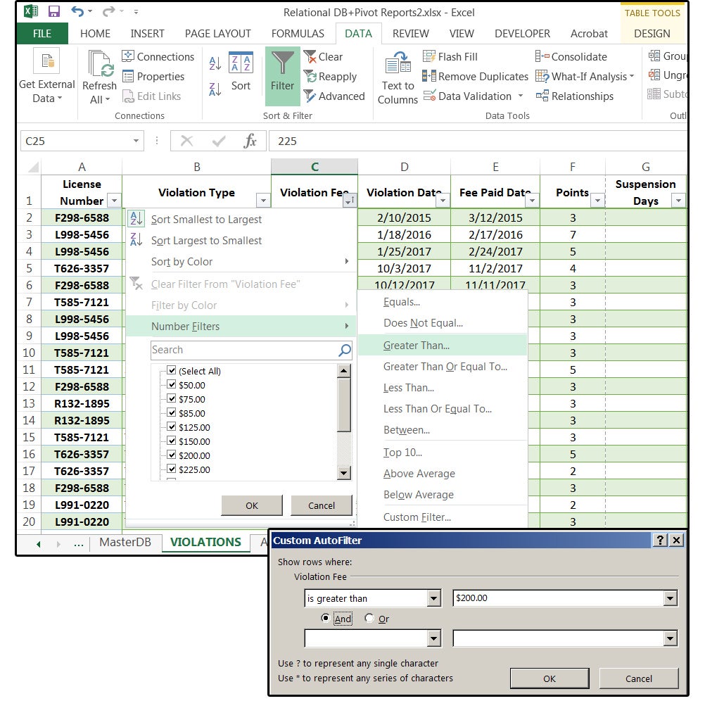
1. Open the database file, then click the VIOLATIONS tab. Place your cursor on column C - Violation Fee. Click the down arrow (right side), choose Sort Smallest to Largest, and click OK.
2. Click the arrow again, select Number Filters > Greater Than.
3. In the Custom AutoFilter dialog window, the field name Violation Fee is displayed under the prompt that says Show Rows Where—Violation Fee: is Greater Than (displays in the first Input box). Click the down arrow beside the second Input box, and select $200.00 from the dropdown list.
 JD Sartain / PC World
Extract Violation Fees Greater Than $200.00
4. Click the Design/Table Tools tab (only visible when the table is active). Click the Summarize With Pivot Table button in the Tools group.
5. In the Create Pivot Table dialog window, enter the current table–VIOLATIONS–in the Table Range field box.
6. In the next field box: Choose Where You Want the Pivot Table Report Placed, click the New Worksheet circle, and then click OK.
7. Notice the Pivot Table Fields panel on the right.
 JD Sartain / PC World
Summarize with PivotTable
Excel displays the Pivot Table Fields list with a message helper box that says: "To build a report, choose fields from the Pivot Table field list."
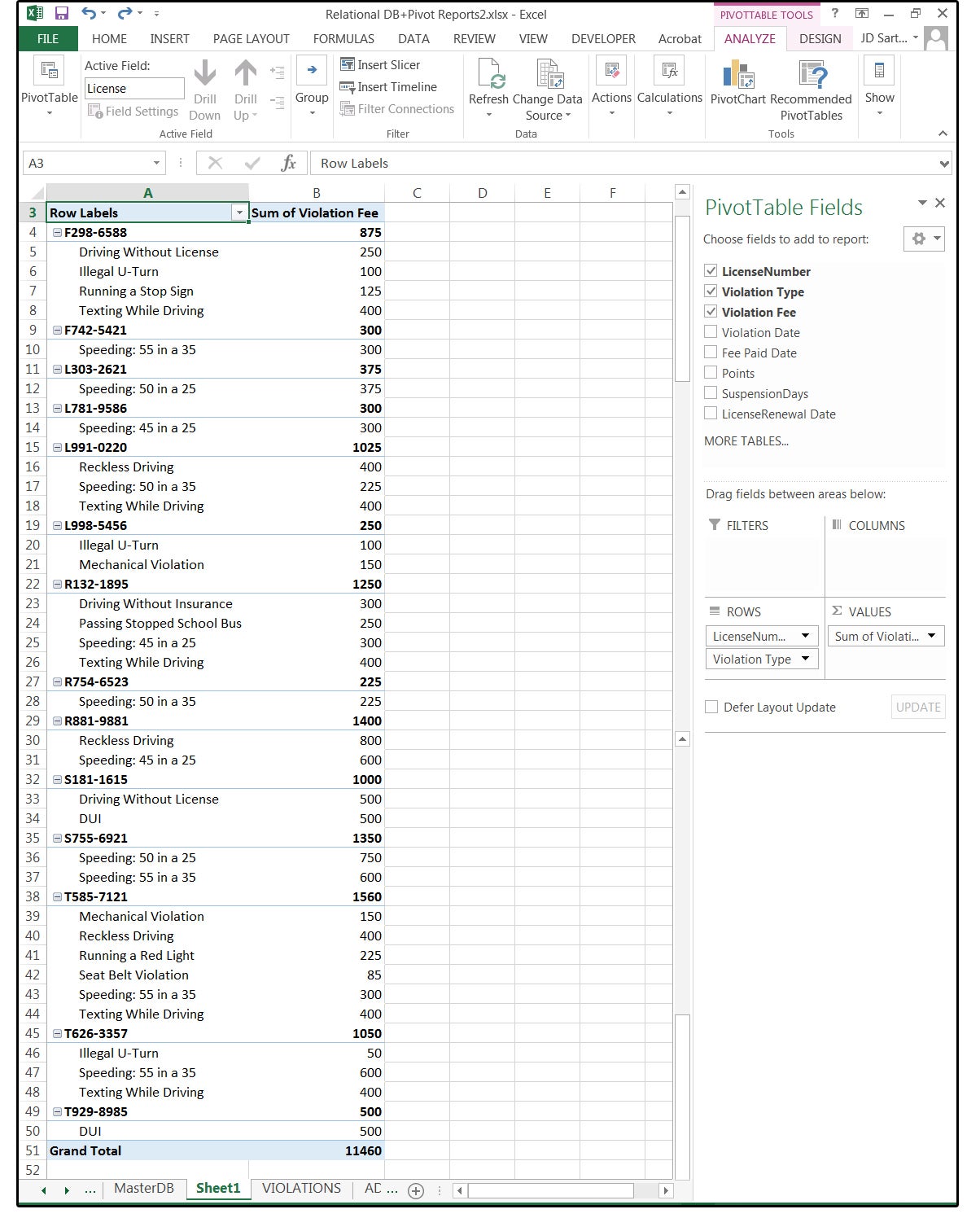
8. For this first report, click the check box for these four fields: License Number, Violation Type, Violation Fee, and Violation Date. Note that Excel builds the report and summarizes the Number fields as you type.
Note: Notice the options at the bottom of this panel: Filters, Columns, Rows, and Values. Click the arrows to open the field boxes under Rows and Values. Note the options provided for each field. We'll cover these features in a future installment.
9. Excel creates a beautiful report sorted by the Drivers’ License Numbers, with the Violation Types sorted alphabetically by Type beneath each License Number, with the fees recorded beside each Violation Type, and then subtotaled by License Number with a Grand Total at the bottom. All you had to do was click the checkboxes beside the fields you wanted in this report, and Excel did the rest. Amazing!
 JD Sartain / PC World
Report: Violations with Fees, by Type for each License Number
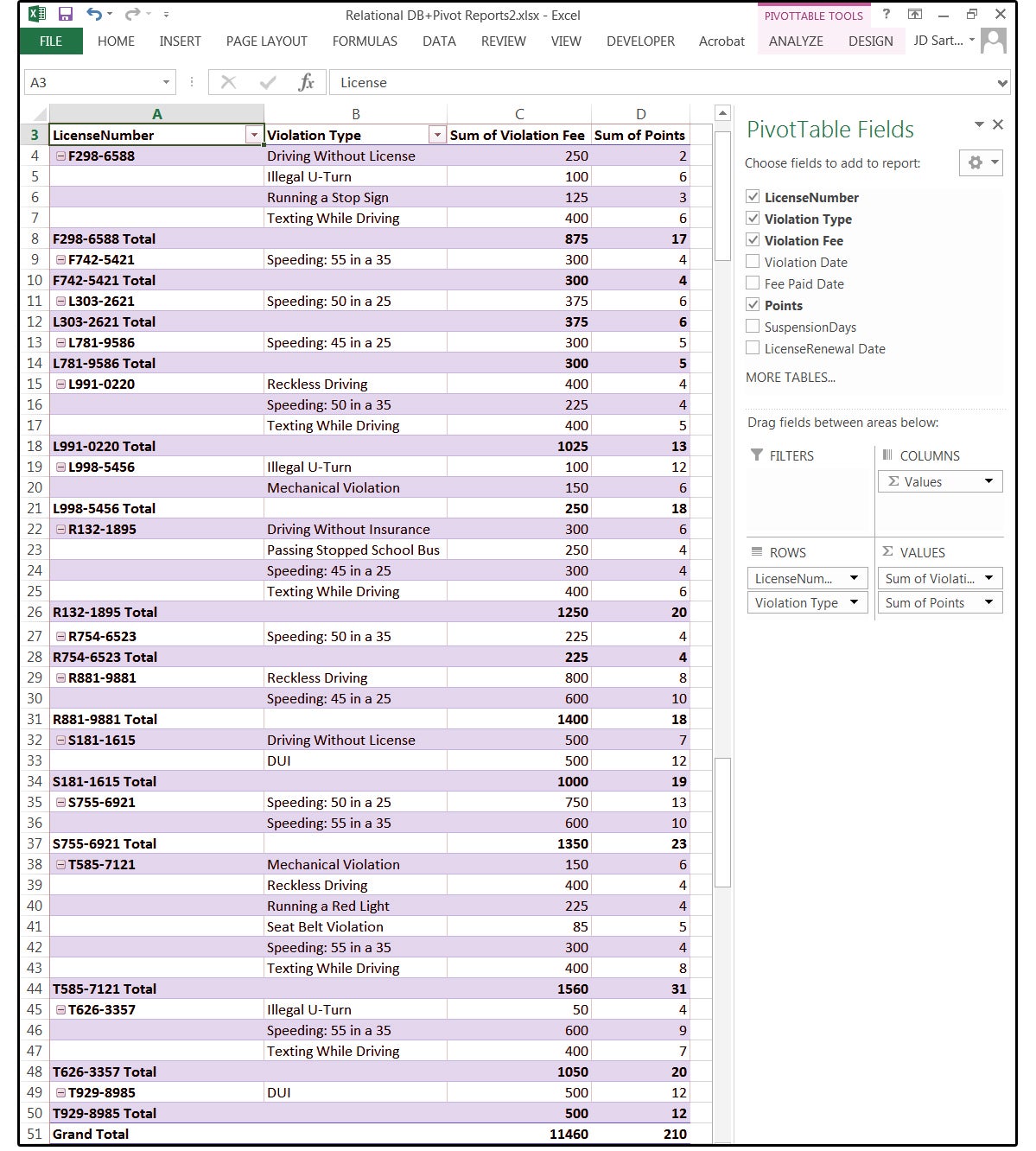
So the report is finished, you hand it to your client, and she says, “I need to see the number of Points that each driver has accrued." No problem. Adding more fields to the Pivot Table report is as simple as clicking another checkbox.
10. Place your cursor anywhere on the current report to activate the Pivot Table Fields panel.
11. Click the checkbox on the field Points.
12. Note the report changes instantly. The Points are listed beside each violation. Excel sums the Points by License Number with a Grand Total at the bottom, and this does not change or affect the previous totals of the Violation Fees.
 JD Sartain / Pc World
Report: Points listed for each violation, then summed by License Number
13. Also notice the tab additions to the Ribbon menu: Pivot Table Tools: Analyze & Design. All of the above is available under the Analyze tab, plus Pivot Charts and Recommended Pivot Tables.
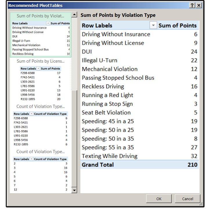
14. Click the Recommended Pivot Tables button. Excel provides an additional seven suggested reports based on the fields in this table. If you prefer one of these other reports, just select it, and then click OK.
 JD Sartain / PC World
Additional suggested reports based on the fields in your table
15. Click the Design tab, and the Ribbon menu changes to reflect the Design menu.
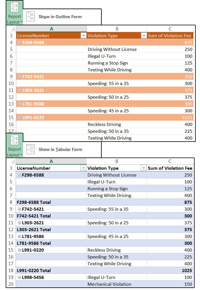
16. The first four buttons in the Layout Group (followed by a submenu of additional options under each selection) provide more features that you can customize. Click through each item to see how your selections affect your report. Note that the current Report Layout is called the Compact form.
Subtotals: Do Not Show Subtotals, Show All Subtotals at Bottom of Group, Show All Subtotals at Top of Group, Include Filtered Items in Totals
Grand Totals: Off for Rows and Columns, On for Rows and Columns, On for Rows Only,
On for Columns Only
Report Layout: Show In Compact Form, Show In Outline Form, Show In Tabular Form,
Repeat All Item Labels, Do Not Repeat Item Labels
Blank Rows: Insert Blank Line After Each Item, Delete Blank Line After Each Item
 JD Sartain / PC World
Additional formatting options in the Layout Group
17. Check the buttons Row Headers, Column Headers, and Banded Rows in the Pivot Table Style Options Group. Headers are necessary to read the reports accurately. Banded Rows mean the table is highlighted or colored on every other row, to make the data in the table easier to read.
18. Next, move over to the Pivot Table Styles Group. Click the small down arrow to view a submenu of many colorful Table Styles. Click once on the Style that fits your project, and it changes instantly. Experiment with several different styles to see how colors and formatting can significantly change your table.
19. Notice the last two menu options on the Pivot Table Styles submenu:Clear and New PivotTable Style. Select the latter, and the New Pivot Table Style dialog window opens with dozens of Formatting features to help you design your own custom Styles.
 JD Sartain / PC World
Choose a colorful PivotTable Style to enhance your table
20. Double-click the spreadsheet tab at the bottom and name your report, then save your file.
Tip: You can change the layout of the Pivot Table Fields panel if the current layout is unsatisfactory. Just click the arrow beside the gear box and choose one of the five different layouts. You can also modify the Task Pane options: Move, Size, or Close. Click the arrow beside the X, then click one of these three options.
Note: Because Excel is so popular, many third-party vendors have created a number of Add In programs such as Tool Kits, Report Generators, Graphic Effects plug-ins, and independent programs that perform a variety of functions. Click File > Options > Add-Ins to view a list of the Add-In applications already installed, then select one of these applications and play around with the features it offers. You may find a valuable tool that you can’t live without.
 JD Sartain / PC World
Report Layouts for the Outline and Tabular Forms