Credit: Acer
Disappointed by your monitor’s image quality? You might be able to improve it through monitor calibration. Learning to calibrate your monitor will make the most of its potential, and while you can purchase expensive tools for this task, you can often achieve a noticeable improvement without them.
This guide will explain how to calibrate your monitor, step by step.
How to start monitor calibration in Windows 10
Windows and MacOS have very basic built-in calibration utilities. They’re limited and won’t help you understand how your monitor works, but they’re a good place to start.
Here’s how to start calibrating a monitor on Windows.
- Use Windows Search to search for display calibration.
- Select Calibrate display color from the results.
- Follow the on-screen instructions.
Here’s how to start calibrating a monitor on MacOS.
- Open System Settings.
- Select Displays.
- Open the Color tab in the Displays menu.
- Tap Calibrate.
- Follow the on-screen instructions.
Taking the next step
The calibration utilities in Windows 10 and MacOS are only a start. They will help you work out serious problems with your calibration, like an incorrect contrast setting or wildly terrible display gamma value. They’re more focused on providing a usable image than an enjoyable one, however. You can do more.
Before we get started, let’s bust a popular myth about calibration: there is no such thing as a perfect monitor or a perfect calibration. Image quality is subjective and, for most people, the goal of calibration should be improving perceived quality on the monitor you own.
With that said, a variety of standards exist. Each provides a set of values everyone can target. Dozens, perhaps hundreds of standards exist, but sRGB is the standard most common to computers. Other common standards include:
- DCI-P3, which was created for the professional film industry. Many “professional” computer monitors target DCI-P3, and Apple targets DCI-P3 in its latest Mac computers, as well.
- Adobe RGB, created by Adobe in the late 1990s to provide a standard for its professional software, including Photoshop.
- 709, a standard created for high-definition television.
You don’t need to target these standards. In fact, precisely targeting a standard is impossible without a calibration tool. Still, you’ll want to be aware of these standards as you calibrate your monitor because they’ll impact how certain monitor settings work. Also, many monitors have settings meant to target them.
How to calibrate resolution and scaling
What you need to know: Your computer’s display resolution should always equal your monitor’s native resolution. If your monitor’s resolution is higher than 1080p, you may need to use scaling to make text readable.
Perhaps it should go without saying, but it’s crucial that you select the correct resolution for your monitor. Windows and MacOS typically select the right resolution by default, but there’s always the chance it’s wrong.
Both Windows 10 and MacOS place resolution control in their respective Display settings menu. The resolution selected should match the native resolution of your monitor, which describes the number of horizontal and vertical pixels physically present on the display. Most monitors will highlight this in their marketing materials and specifications.
Once resolution is set, you should consider scaling. Imagine a button that’s meant to be displayed at 300 pixels wide and 100 pixels tall. This button will appear much larger on a 1080p monitor than on a 4K monitor if both monitors are the same size. Why? Because the pixels on the 1080p monitor are actually larger!
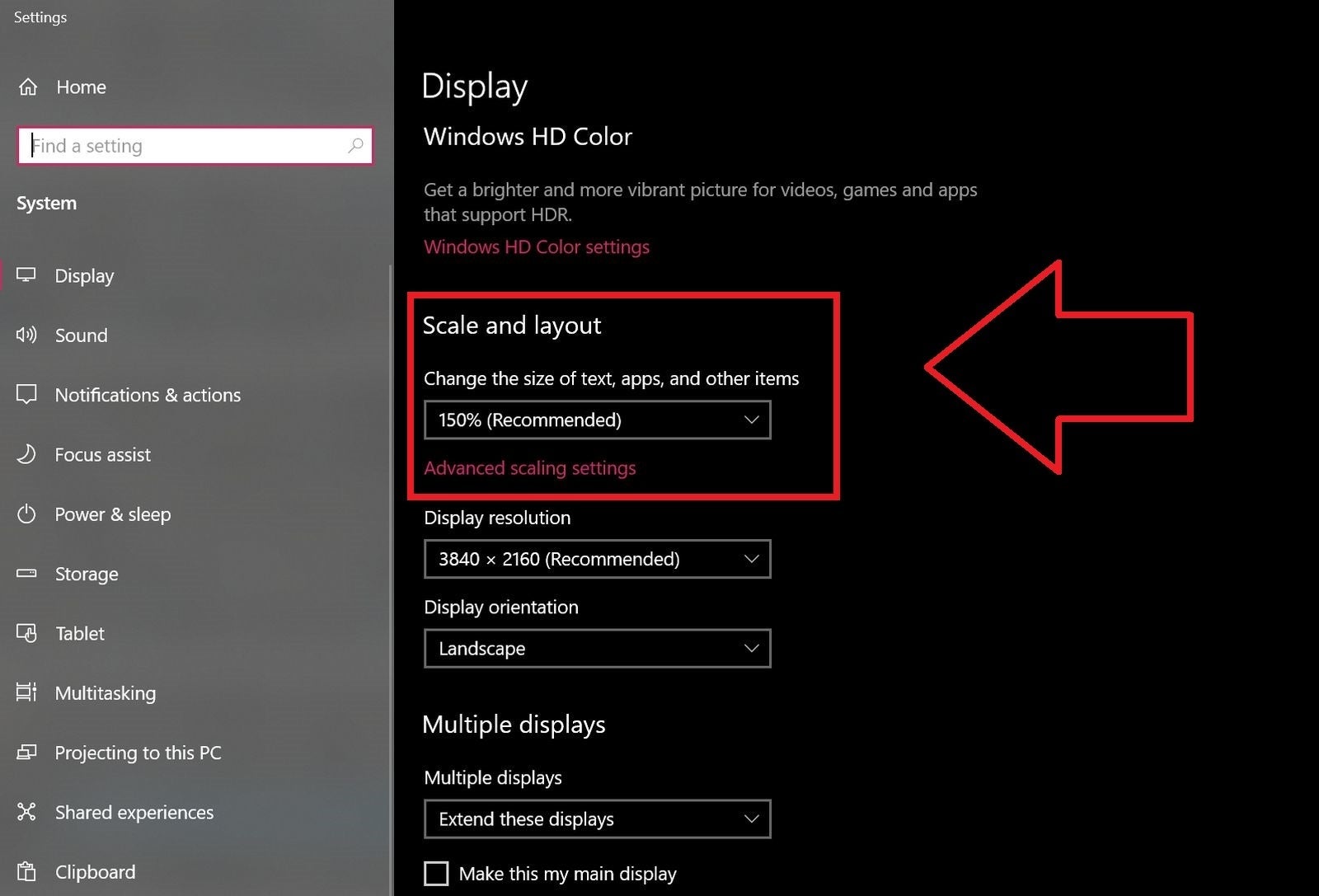 Brad Chacos/IDG
Windows 10's resolution scaling option defaults to 150% on a 4K monitor.
Scaling resolves this issue. Again, Windows and MacOS include a scale setting in their respective Display menus. Windows expresses scale as a percentage. A higher percentage scales up content. MacOS instead uses scaled resolution, which is a bit more confusing. You’ll change Scaled Resolution to a lower setting to increase the size of the interface.
Unlike resolution, which should always be set to your monitor’s native resolution, there’s no right answer for scaling. It’s a matter of personal preference. Increasing scale will reduce the amount of content you can see at once, which makes multitasking more difficult, but can reduce eye strain or potentially neck and back strain (since you won’t feel an urge to lean in).
How to calibrate brightness
What you need to know: Reduce the monitor’s brightness to a setting that remains easy to view but doesn’t reduce detail in a dark image. If possible, use a light meter on a smartphone to shoot for a brightness of about 200 lux.
You may not be shocked to learn that turning brightness up makes your monitor brighter, and turning it down makes it less bright. Simple enough. But what does this have to do with calibrating a monitor to improve image quality?
Nearly all monitors sold in the last decade have a backlit LCD display. This means they have a LCD panel with a light behind it. The light shines through the LCD to produce an image (otherwise, it’d look like the Gameboy Color).
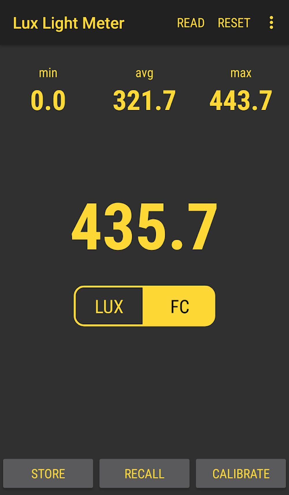 Matt Smith/IDG
Lux Light Meter
It’s a simple setup that’s thin, light, energy efficient, and easy to produce, but there’s a downside. Your monitor’s deepest, darkest black level is directly changed by the monitor’s brightness. The higher the brightness, the more gray, hazy, and unpleasant dark scenes will appear. You’ll notice this in movies, which often rely on dark scenes, and in certain PC game genres, like horror and simulation.
The solution? Turn down the brightness of your monitor as much as possible without making the image seem dim or more difficult to see. If you want to get more precise, you can use a free light measurement app like Lux Light Meter. I recommend about 300 lux for most rooms, though you might want to dip as low as 200 in a nearly pitch-black gaming den.
Aside from improving dark scenes and perceived contrast, reducing brightness can reduce eye strain. Viewing a very bright monitor in a dim room is not pleasant because your eyes must constantly adjust to deal with the difference in brightness between the display and its surroundings.
How to calibrate contrast
What you need to know: View the Lagom LCD contrast test image and adjust contrast so that all bars on the test image are visible.
Contrast is the difference between the lowest and highest level of luminance your monitor can display. The maximum difference a monitor can produce is its contrast ratio. Contrast can be improved by increasing the maximum brightness, lowering the darkest possible black level, or both.
 Matt Smith/IDG
All monitors have a contrast setting, but it rarely does what you’d expect. Turning the contrast up to its maximum setting can actually reduce the contrast ratio by bumping up the monitor’s deepest black level. It also can crush color and shadow detail.
To calibrate contrast, visit the Lagom LCD contrast test image. An ideal contrast setting will let you see all color bars from 1 to 32. This can be a real challenge for an LCD monitor, especially on the dark end of the image, so you may have to settle for a lack of visible difference in that area.
On the other hand, setting the contrast too high will cause colors at the high end of the spectrum to bleed into one. This problem is avoidable on a modern LCD monitor by turning down the contrast which, in most cases, is set to a high level by default.
How to calibrate sharpness
What you need to know: Sharpness is highly subjective, so pick whatever setting looks best to you.
Sharpness is an odd setting. Many monitors let you change sharpness, but sharpness isn’t a technical term. There’s no objective measurement for sharpness and it’s not part of standards like sRGB or DCI-P3.
A change to a monitor’s sharpness setting changes how the monitor’s post-processing handles the image sent to it. High sharpness will exaggerate details and contrast between objects. That might sound good, but it can lead to chunky artifacts and make details look unnatural. Low sharpness will blur details and contrast, which can look more organic but eventually leads to a smeared, imprecise quality.
There’s no right or wrong answer. View a detailed, high-contrast image and flip through your monitor’s sharpness settings to decide which appeals most to you.
How to calibrate gamma
What you need to know: Visit the Lagom LCD gamma test image and adjust your monitor’s gamma settings until the image indicates a gamma value of 2.2.
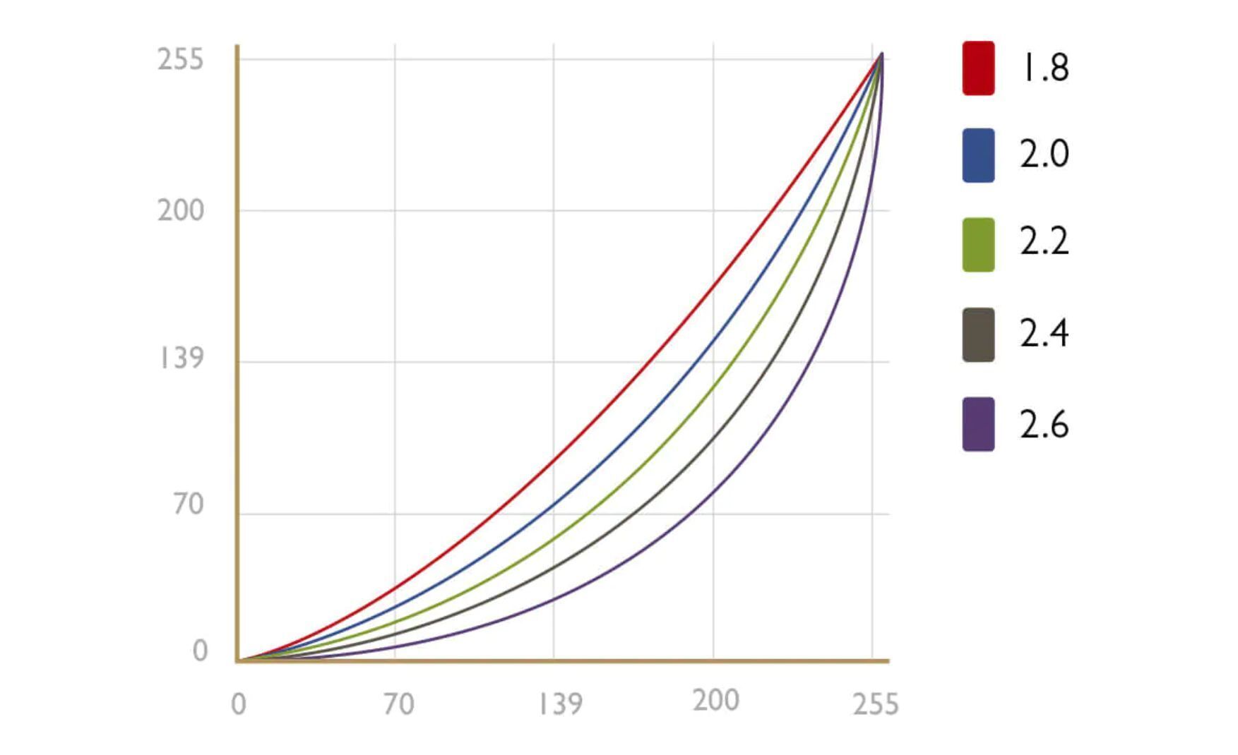
For our purposes, gamma describes how a monitor handles the luminance of an image sent to it. This is called display gamma. A high gamma value (such as 2.6) will appear deeper and may have more contrast, while a low gamma value (such as 1.8) will appear brighter and may show more detail in dark areas.
There’s no “correct” gamma value. However, the sRGB standard settled on a gamma value of 2.2, or something close to it, as the preferred value. This is a solid all-around option for a computer monitor. It’s bright enough to be easy to use but offers decent detail in darker areas.
 BenQ
BenQ
Gamma correction.
You need a calibration tool to precisely adjust gamma, but you can make improvements using the Lagom LCD gamma test image. As its instructions say, you’ll want to sit back from your monitor (about five or six feet away) and look at the color bars, each of which is made up of several bands. You’ll see a point on each bar where the bands start to blend together. The gamma value indicated where this occurs is your monitor’s approximate gamma value.
If you see the bars blend around a value of 2.2, congratulations. Your gamma is already in the ballpark. If not, you’ll want to make some adjustments. There’s several ways to do this.
Your monitor may include gamma settings in its on-screen control menu. Less expensive monitors will have a selection of vaguely labeled viewing modes, like “office” or “gaming,” with their own prebaked settings. You can flip through these while viewing the Lagom LCD gamma test image to see if they improve the gamma.
More expensive monitors will have precise gamma settings labeled with a gamma value, including a value of 2.2, which is usually ideal. Again, flip through the available settings to find one that appears correct while viewing the test image.
If neither option works, or your monitor simply lacks gamma adjustment options, you can try software that changes the gamma of your display. Windows users can use a utility such as QuickGamma. Driver software from AMD and Nvidia also offer settings to let you tweak gamma. MacOS users can consider Handy Gamma as a free option or look at Gamma Control 6 for in-depth options.
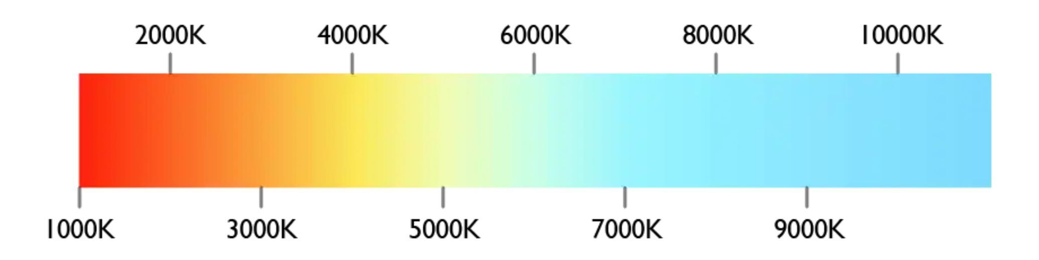
How to calibrate color temperature and white point
What you need to know: Color temperature is controlled by the color temperature or white point setting on your monitor. Look for a value of 6500K if available. Otherwise, open a blank white image or document and flip through the available color temperature options. Pick the one that looks best to you.
Color temperature describes how the color of your monitor skews between a “warm” or “cool” character. Lower temperatures provide a warmer look, which skews towards red and orange, while higher temperatures provide a cooler look, which skews towards blue and cyan. The term white point is often used interchangeably with color temperature.
Color temperature values are described as a literal temperature in degrees Kelvin which, frankly, is pretty weird if you’re not familiar with display technology (and still a little weird if you are). But don’t worry. Changing your color temperature won’t start a house fire or even warm the room.
 BenQ
BenQ
Color temperature values.
As with gamma, there’s no absolute “correct” color temperature. It’s even more variable because perceived color temperature can change significantly depending on viewing conditions. But, also like gamma, most image standards have settled on a generally agreed ideal value which, in this case, is a white point of 6500K.
No test image can help you target a specific white point. You need a calibration tool for that. However, most monitors will have several color temperature settings that you can flip through in the monitor’s on-screen menu.
Less expensive monitors will use vague values, such as “warm” and “cool,” while more expensive monitors will provide precise color temperature adjustments, such as “5500K” or “6500K.” MacOS includes color temperature adjustment as part of its default display calibration.
Outside of standards, color temperature is rather subjective. A truly out-of-whack gamma value can destroy detail, making dark scenes in movies unwatchable and dark levels in games unplayable. Color temperature problems are less severe. Even a very odd white point setting (like, say, 10000K) is usable, though most people perceive it as having a harsh, clinical look.
So, how do you dial in color temperature without a calibration tool? I find it’s best to view a blank white screen, such as a new image or document, and then flip through the available color temperature settings. This will help you settle on a setting that fits your preferences.
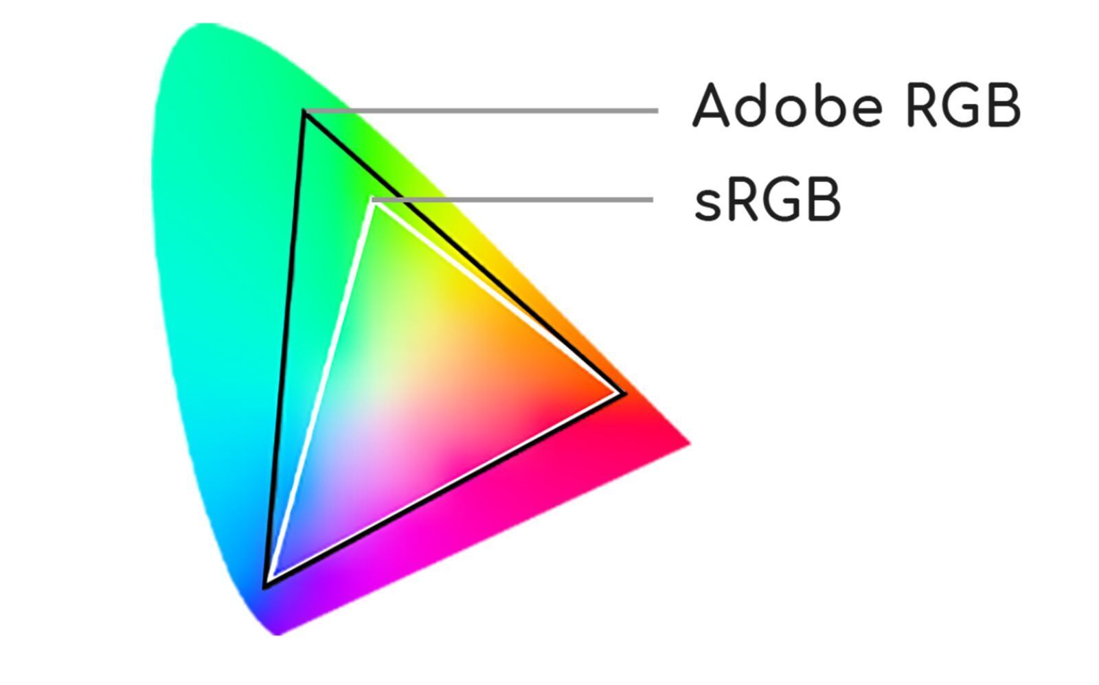
How to calibrate color gamut
What you need to know: Look for an sRGB mode if your monitor doesn’t support a wide color gamut, or a DCI-P3 mode if your monitor does. This may lock your monitor’s brightness to a lower level than you prefer, however.
A monitor’s color gamut is the range of colors that it can display. Even the best monitors can’t display every possible color in the universe. This is not only because of limitations in monitor technology but also limitations in how computers handle color data.
A color gamut is described in reference to a specific standard like sRGB or DCI-P3. You’ll also see the term “wide gamut” used by monitors. This means the monitor supports a color gamut wider than the sRGB standard which, relative to other standards, is narrow. Most wide gamut monitors support DCI-P3 and Rec. 709.
 Acer
Acer There’s a big problem with color gamut on most monitors, however. The color gamut associated with a standard is often tied to other aspects of the standard you might not prefer, like gamma and brightness.
Worse, it’s common for monitors to lock brightness and gamma controls when you select an sRGB, DCI-P3, or Rec. 709 mode. The theory is that you shouldn’t be able to knock the monitor out of compliance with the standard while in these modes, which makes sense if you’re working on a Pixar film, but doesn’t make much sense otherwise.
In the end, color gamut isn’t a very useful part of monitor calibration for most people. Try the sRGB or DCI-P3 modes, if available, but be prepared for disappointment if those modes lock your monitor’s brightness and gamma.
The next level: Advanced calibration with a calibration tool
Most people can achieve a boost to image quality by calibrating their monitor by eye. The result won’t conform to any standard, but it will be noticeably different from the settings the monitor shipped with.
If you want to take calibration to the next level, however, you need a calibration tool. A calibration tool has a sensor that can judge whether your monitor’s image conforms to accepted standards like sRGB and DCI-P3. This is especially important for color accuracy. There’s no way to gauge color accuracy with the naked eye.
 Datacolor
Datacolor's SpyderX Pro.
Datacolor’s SpyderX Pro is my preferred calibration tool. The SpyderX is extremely fast and simple to use, which is important, as calibration can become confusing and time consuming. The SpyderX Pro is great for most people and priced at a relatively affordable $170. X-Rite’s i1Display Studio is another good option, though I haven’t used the latest model. It’s also priced at $170.
If you do buy a tool, you can throw most of the advice in this guide out the window. Calibration tools come with software you’ll use with the tool and, after calibration, will load a custom display profile.
Is a calibration tool worth it?
No, not for most people.
A monitor calibration tool has become less important as monitor quality has improved. I’ve reviewed monitors for over a decade, so I’ve witnessed this progress first hand. Today’s monitors are more likely than ever to have acceptable contrast, gamma, and color out of the box. Most ship at a default brightness that’s too high, but that’s an easy fix.
Even content creators may not need a calibration tool. Calibration is often considered a must for professionals, but the definition of professional is not what it used to be. Tens of thousands of self-employed creators make excellent content without ever touching a calibration tool. These creators don’t have to conform to any standard aside from what they think looks great. It’s true some creators have a reputation for remarkable image quality and slick editing, but most just use whatever they have at hand.
With that said, some professionals work for employers or clients who require content created to a standard like sRGB, DCI-P3, or Rec. 709. An employer or client may even have custom standards applicable only to work created for them. The film industry is an easy example: a film editor working at a studio can’t just turn over footage edited to look however the editor prefers. That’s when a calibration tool goes from a luxury to a necessity.
What about HDR?
PC World’s guide to HDR on your PC goes in-depth on HDR, but there’s something you should know as it relates to calibration: you can’t do much to calibrate a monitor’s HDR mode.
 Asus
Asus
HDR can rock your socks (and sear your eyeballs) but you can't tweak it.
Monitors almost always rely on the HDR10 standard when displaying HDR, and treat HDR just like sRGB or DCI-P3 mode. In other words, activating the mode will lock the monitor to settings meant to conform to the HDR10 standard, disabling image quality adjustments you might normally use to calibrate the monitor. There’s other technical hurdles, too, though they’re outside the scope of this guide.
There’s no solution for this as of yet. Monitors aren’t alone in this. Consumer televisions face similar obstacles.
Calibration cheat sheet
Here’s a quick summary of what you should do to calibrate a monitor.
- Set the display resolution of Windows or MacOS to the native resolution of your monitor.
- Select a scaling setting that makes small text and interface elements readable.
- Reduce brightness to about 200 lux (using a smartphone light meter for measurement).
- Adjust contrast so that all bars on the Lagom LCD contrast test image are visible.
- Set sharpness to the level you prefer.
- Adjust gamma so that bars on the Lagom LCD gamma test image indicate a gamma value of 2.2.
- Set monitor color temperature (also known as white point) to 6500K if that setting is available, or change it to your preference if it’s not.
- Switch to an sRGB mode if your monitor has a standard color gamut, or DCI-P3 if your monitor has a wide color gamut.
- If you’re willing to spend some cash for better image quality, buy a calibration tool like the Datacolor SpyderX Pro or X-Rite i1Display Studio.
These tweaks will improve the image quality of any LCD monitor. The worse the monitor, the more noticeable the change will likely be. Today’s best monitors are good out of the box, but entry-level monitors receive less scrutiny and allow more variance between monitors. Calibration won’t make a budget monitor compete with a flagship, but it can make the difference between a washed-out image quality dumpster fire and a perfectly fine day-to-day display.