


The next wave of security threats are upon us: Here’s what you need to know
Sponsored By


Macworld.com
21/07/11
In the past, Apple has charged $129 for upgrades with far fewer improvements than this, and that price upgraded just a single system. At $30 for all the Macs in your world, the only reason not to upgrade to Lion is because you rely on old PowerPC-based apps that won’t run on it. Otherwise, it’s a more than fair price for a great upgrade.
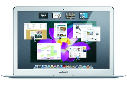
Launchpad is one of the most obviously iOS-inspired new features in Lion. It's the Mac version of the app home screens you see on an iPhone and iPad. Like Mission Control, Time Machine, and Dashboard, Launchpad is a basic operating-system feature that looks like an app itself: It's in the Applications menu and, by default, in the Dock. You invoke it by launching the app, by using a hot key, moving the cursor to a hot corner, or by performing a Multi-Touch gesture.
The contents of Launchpad are essentially the contents of your Applications folder. Every launchable app in that folder shows up in a tiled list of icons in Launchpad. Apple stocks its own apps on the first page of Launchpad; other apps are listed alphabetically starting on page two. New apps you add, including those downloaded from the Mac App store, appear at the end of the list.
You can re-organize the apps in Launchpad much as you do on iOS: by dragging app icons around one by one. Drop one icon atop another and you create a folder (which you can rename). You can even delete apps you bought on the Mac App Store by clicking on an "X" icon next to the application icon.
Launchpad seems like an excellent solution for new and novice users, allowing them to survey all the apps on their system and find the one they want to open. For users familiar with iOS conventions, it will feel familiar. It appears to be an effort to steer those users away from the Finder and into an easier-to-use, more familiar launching interface; the Dock's just not big enough to encompass every app you might have.
For Mac users with some experience, or just those with lots and lots of apps, Launchpad will be a disappointment. Organizing it is just as laborious as organizing home screens on iOS: It's an endless series of clicks and drags. You can't remove or hide items from Launchpad; every little AppleScript and installer utility on my system showed up there. Instead, you can exile them to folders on Launchpad's back pages. It turns out to be a lot of work for something that's supposed to be simple.
And that's probably the truth of it: For people with a few downloaded Mac App Store apps and the stock stuff that comes when you buy a new Mac, Launchpad is a decent organizing tool. The rest of us might just want to pull it out of the Dock, turn off all the keyboard shortcuts and pretend it doesn't exist.
Despite all of the new interface elements, the Finder is still the hub of activity on the Mac. For many people, the Finder is the Mac: it's the thing that's always there, even when you're not running any apps. But while Apple isn't necessarily trying to kill Finder, it is trying to get us to spend less time futzing around with files and folders.
One way it does so is with the new All My Files view in the Finder. It's basically a Spotlight search for every file an end-user might interact with, including contacts, events, to-do items, images, PDFs, and so on. I'm actually surprised it took Apple this long to come up with it.
Another way the Finder makes files and folders less futzy is the Arrange By command, which now divides the window into sections, with files and folders sorted and separated accordingly. It's on by default when you view All My Files, but it's also available in any Finder window. You invoke it from the item arrangement drop-down menu in the Finder toolbar or by selecting View -> Arrange By. In either case, you can select to view files by kind, name, application, the date they were last opened, modified, added, or created, and more. As with so many other Lion features, if you don't like this one you can tell the Finder to display files in the classic style by choosing View -> Arrange By -> None. But I found it a great convenience to organized All My Files by Date Modified; it gave me an at-a-glance look at all the files I'd used in in the past few days. Most of the time, whatever I was looking for was in that list.
All My Files doesn't show you every file and folder on your system. That's part of an apparently concerted effort by Apple to simplify the Mac experience for less advanced users. Other ways it's doing so: The user Library folder is now hidden by default. You can still get to it (by choosing Go -> Go to Folder... or typing Command-Shift-G, then entering in ~/Library, for example, or by opting to make hidden files visible). And when you try to drag an app out of the Applications folder, the Finder will create an alias for it rather than actually move the app. (You can hold down the Command key while you drag to really make it move.) Neither of these changes is earth-shattering, but they indicate Apple's new way of thinking: The company is trying to anticipate points of confusion among new Mac users--poking around in sensitive folders, moving apps inadvertently--and close them off.
Yet another change to the Finder is one that will probably benefit advanced users even more than novices: The search box in the Finder has been dramatically improved. When you type in a search string, you can specify exactly what you're searching for from a drop-down menu: if you type logo, for example, you can choose to look specifically for files with logo in their names. You can also keep combine multiple search terms: do your logo search, then type image and select Kinds: Image from the drop-down, and you're searching only for images with the word logo in the filename. You could do all this before with Spotlight wildcards, but it's vastly easier to discover and use now. I wish the systemwide Spotlight menu behaved the same way, but it doesn't.
As with just about everything in Lion, there are other, smaller changes scattered throughout the Finder that longtime Mac users will likely notice. The sidebar has been redesigned to look more like the one in iTunes, with monochrome icons. Quick Look views have been redesigned and now feature a button to open a document in its default app. You can now select a bunch of files and use a New Folder With Selection command to file them all in one place.
What's new, plus best mac-related tips
and tricks
The latest business news, reviews, features and whitepapers

Watch our video news and reviews from around the world

Comprehensive buying guides, features, and step-by-step articles

Aruba Instant On AP11D

Set up is effortless.
Aruba Instant On AP11D

The strength of the Aruba Instant On AP11D is that the design and feature set support the modern, flexible, and mobile way of working.
Aruba Instant On AP11D

Aruba backs the AP11D up with a two-year warranty and 24/7 phone support.
Dynabook Portégé X30L-G

Ultimately this laptop has achieved everything I would hope for in a laptop for work, while fitting that into a form factor and weight that is remarkable.
MSI P65

This smart laptop was enjoyable to use and great to work on – creating content was super simple.
MSI GT76

It really doesn’t get more “gaming laptop” than this.